Swappable themes
FlowDrop's look and feel is fully themeable through CSS custom properties — swap palettes, spacing, and radius without touching component code.
FlowDrop is designed to blend into your product, not the other way around. Every
surface, color, border, and spacing value is driven by semantic CSS custom
properties (--fd-*), so you can re-skin the entire editor — nodes, sidebar,
toolbar, playground, and dialogs — by overriding a handful of tokens.
Three themes, one editor
FlowDrop ships with three themes out of the box. Each is just a set of --fd-*
token overrides — the same editor, re-skinned. Launch any of them live in the
demo:
Default
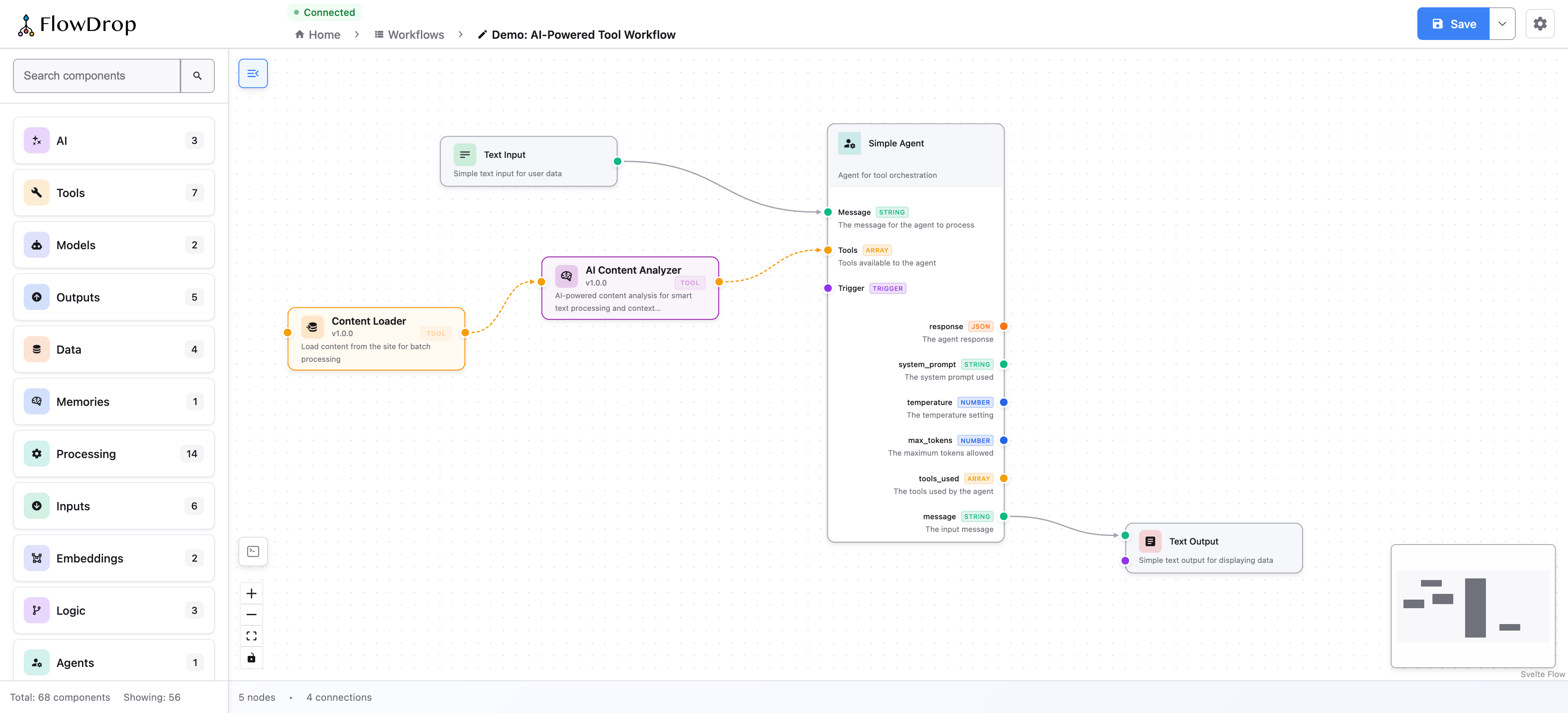
Full chrome and node palette — the standard FlowDrop feel.
Minimal
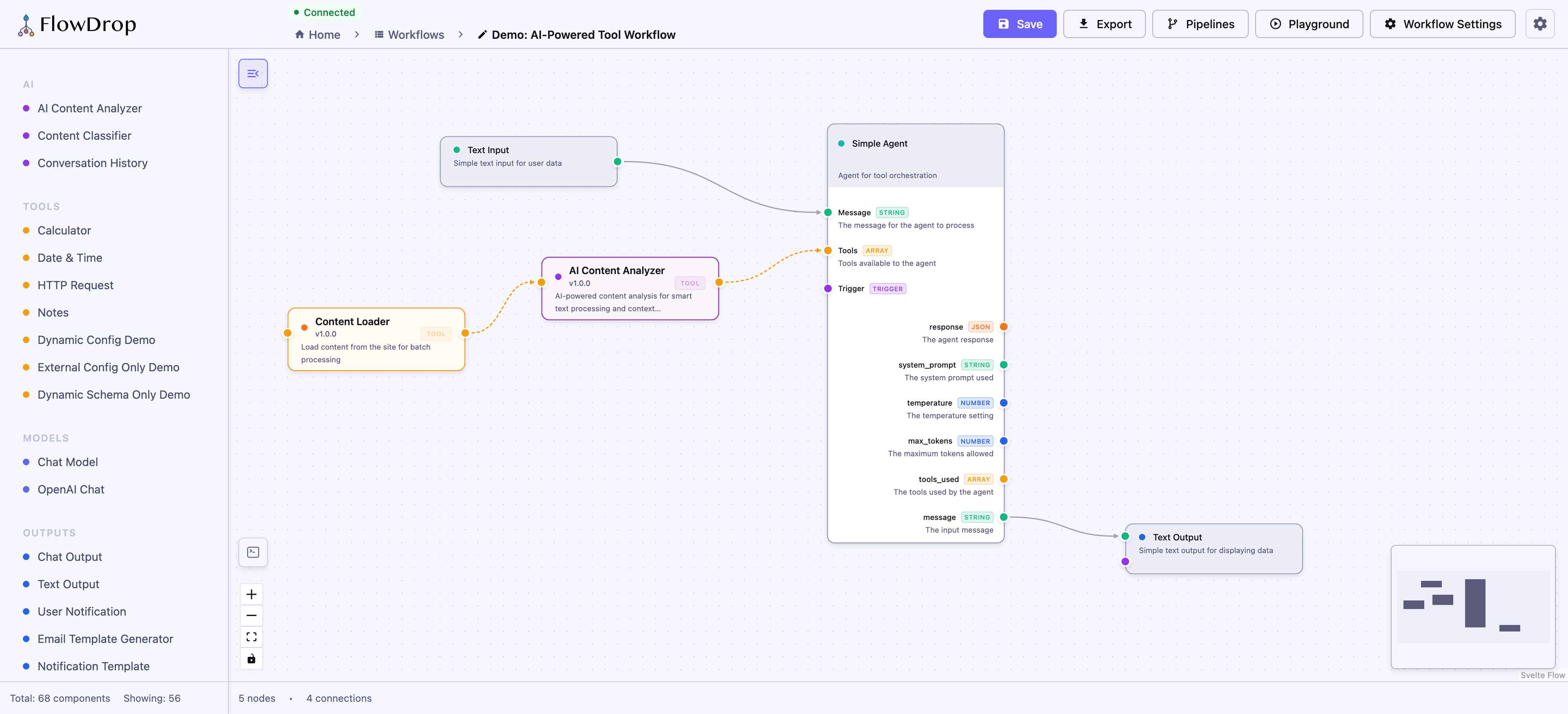
Quieter chrome for embedding inside an existing UI.
Drafter
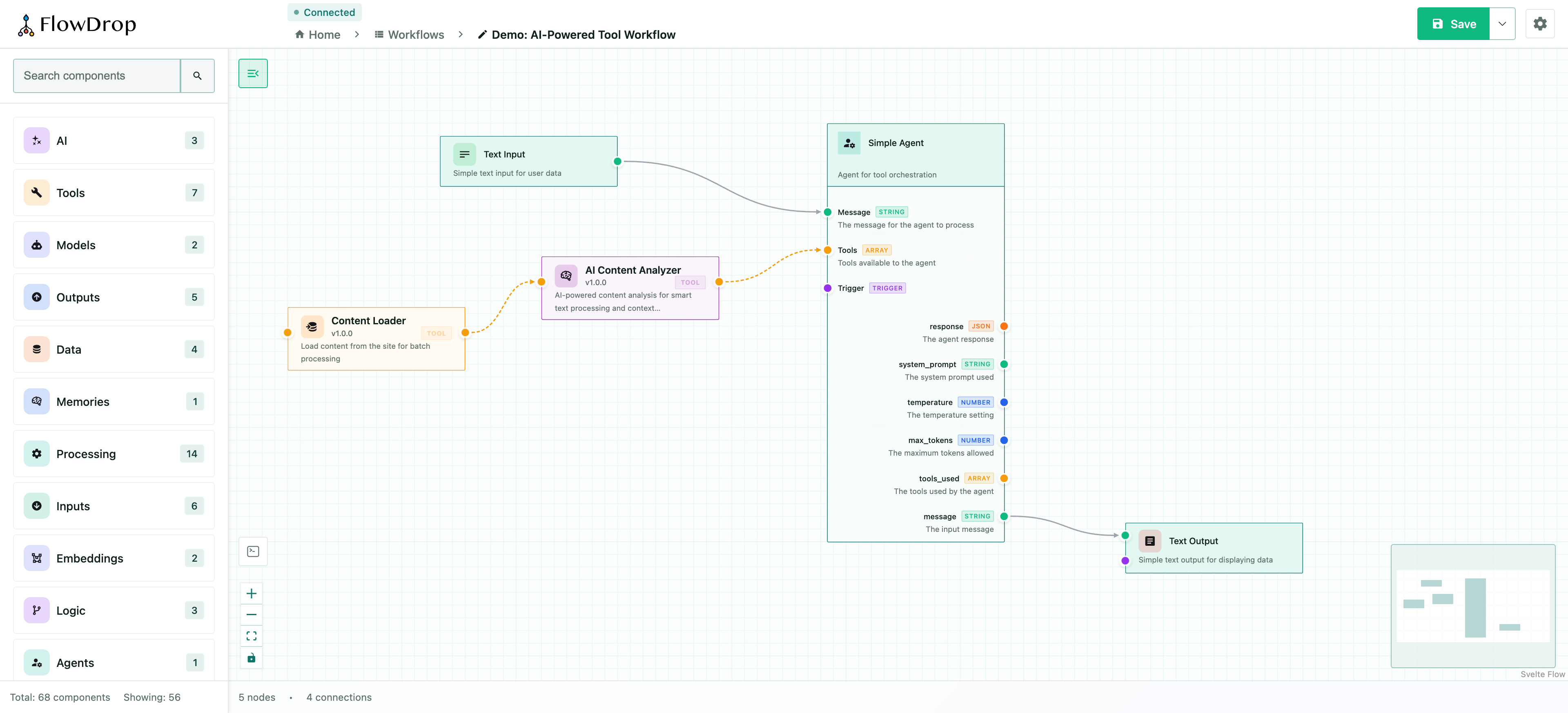
A sketch-like, low-fidelity whiteboard skin.
How it works
Themes are just sets of token overrides. Because every component reads from the
same --fd-* semantic tokens, changing a token cascades everywhere at once:
:root {
  --fd-primary: #8b5cf6;
  --fd-primary-hover: #7c3aed;
  --fd-radius-md: 0.75rem;
}
Swap themes at runtime by toggling a class or data- attribute on a wrapping
element and scoping your token overrides to it:
[data-fd-theme='violet'] {
  --fd-primary: #8b5cf6;
  --fd-primary-hover: #7c3aed;
  --fd-accent: #8b5cf6;
}
Dark mode works the same way — every semantic token has a dark-mode equivalent
that activates automatically via data-theme="dark".
Go deeper
Theming guide
Full token reference — surfaces, borders, status colors, spacing, radius, typography, node layout, and ready-to-use theme examples.